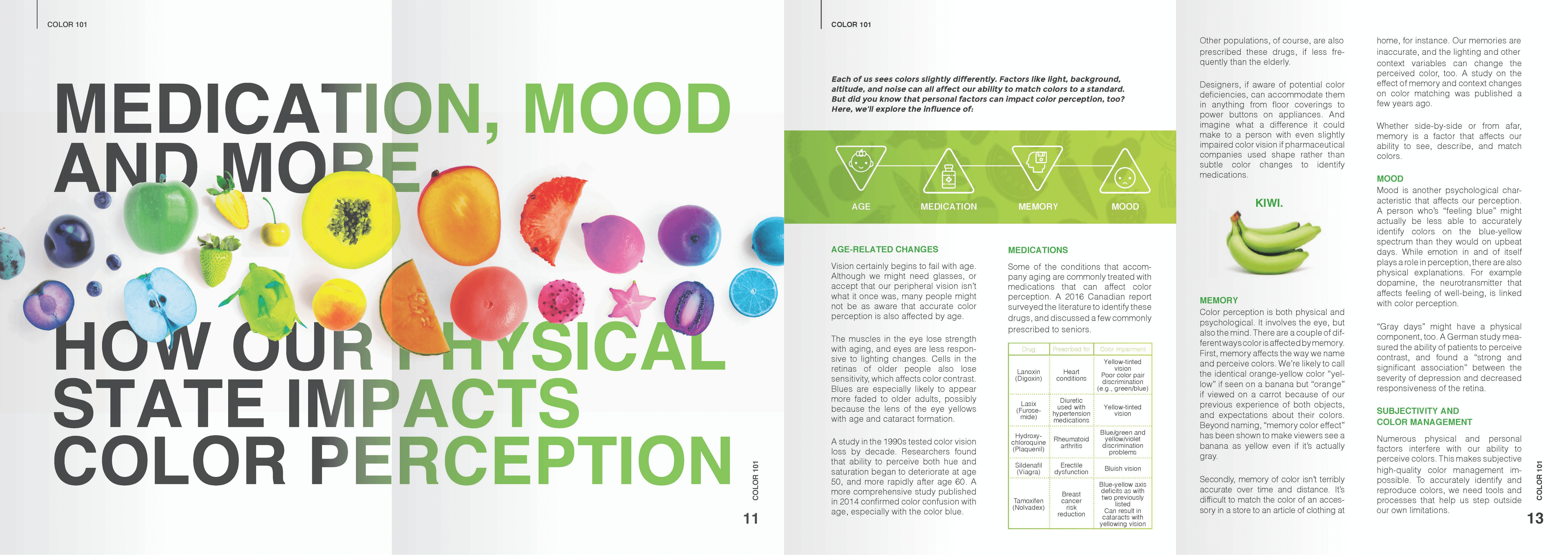
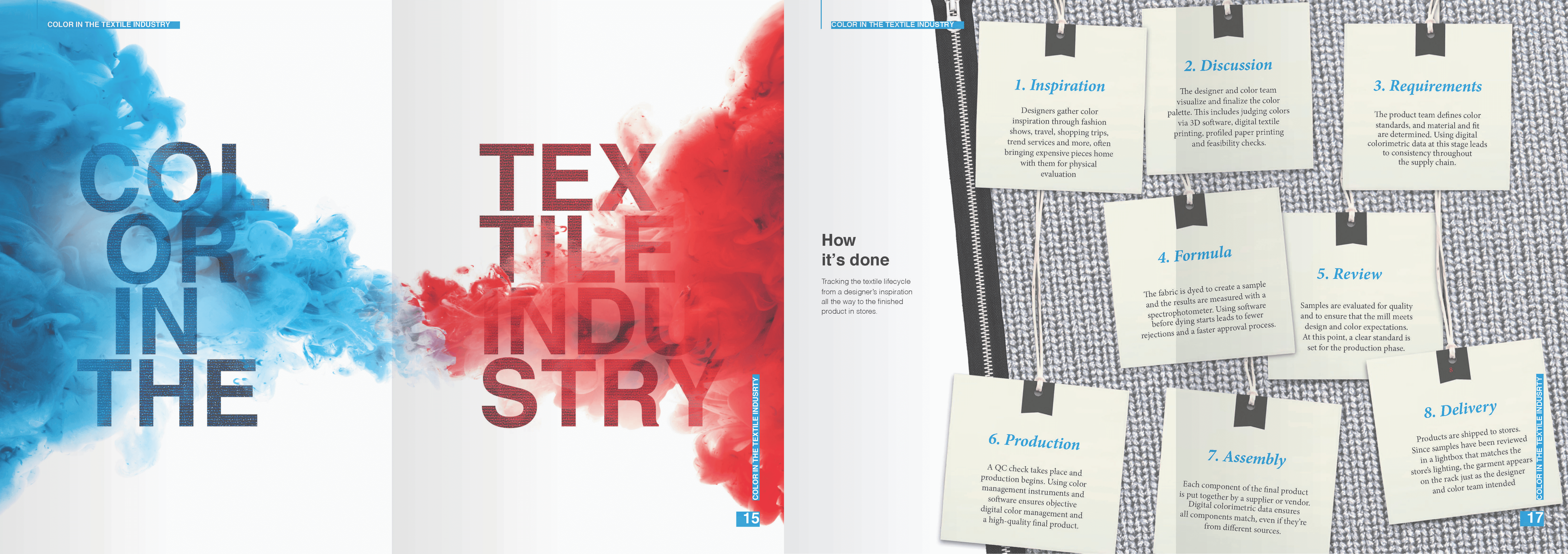
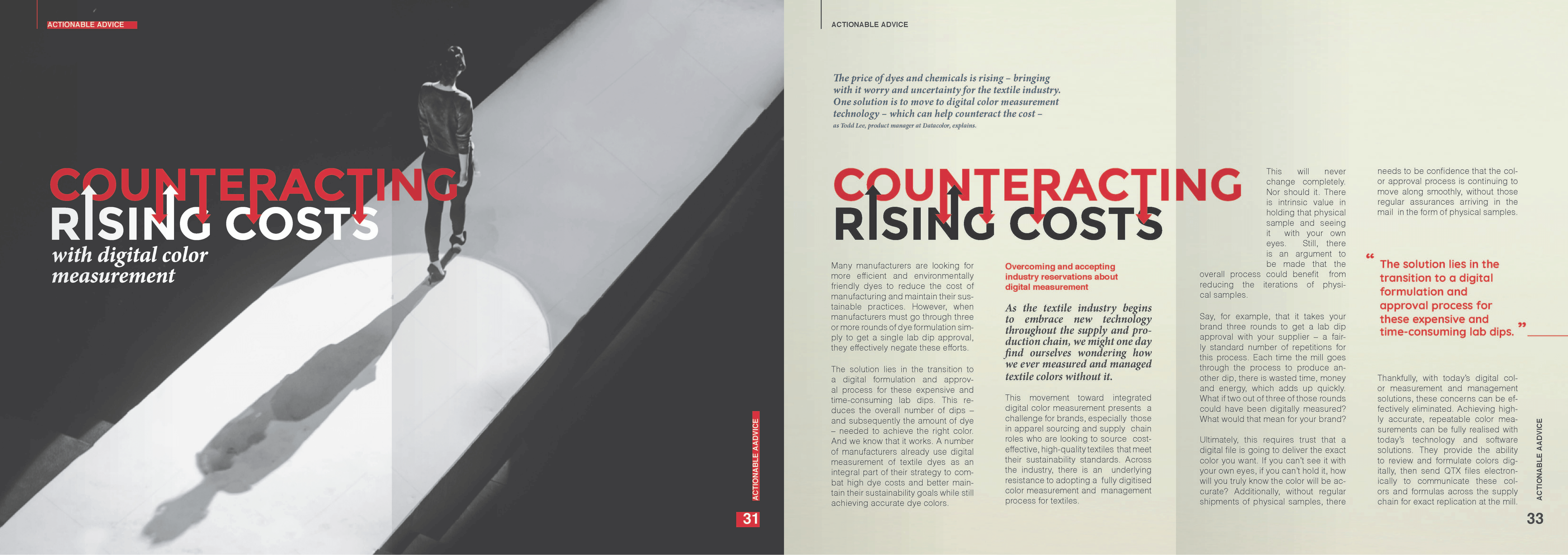
When we first received the call to design a magazine targeted at the Textile and Apparel industry, we were intimidated. Our client wanted to break away from their usual corporate design language and move toward a more flashy and playful aesthetic. As the world leader in color measurement science, Datacolor was looking to get the attention of decision makers in the Textile & Apparel industries and highlight for them how maintaining color accuracy throughout the supply chain can impact their bottom line.
For this magazine design, our team decided to create a completely fresh look for each new article, to keep the reader interested in turning to the next page. According to our designer Dominique, this decision had its basis in brain science. “Humans are creatures of habit. Our attention span is no more than about 30 seconds. Constant repetition causes the brain to become sluggish. To keep excitement constant, advertising content is redesigned for multi-part media. For this reason, we considered a “new page-new layout” principle. With each new page that the reader turns, a new small amount of hormone is released. The same hormone that makes us happy when we get an Instragam “like”.”


Our wish is that “Streamlined” magazine evokes a surprised smile with every page turned. You can experience this yourself by downloading the whole magazine here.


2 Comments
admin · November 28, 2022 at 3:24 pm
Thanks for mentioning our design in your article!
Photography and Type Blog Post – Morgan's Designs · May 19, 2022 at 6:03 pm
[…] [Link deleted][…]